COS, right at your finger tips! Canadianoptical.com
Saturday, May 20 2017 | 00 h 00 min | News, Press Release
Montreal, QC — COS announces the launch of the first phase of its website: canadianoptical.com.
In 2012, the COS team engaged Imarklab, an interactive marketing agency that specializes in user research. The goal: to get a better understanding of its clientele in order to respond more efficiently and effectively to their daily needs. The agency undertook a mandate to better understand the behaviour of future COS website users, how they would be using the site as well as their behaviours on different digital platforms. They determined two user types:
- the optician and / or dispenser, whose job is to advise patients on the show room floor;
- the manager or branch director in charge of ensuring the store is well-stocked.
“Starting with a blank page meant that we were able to do things right the first time. It gave us time to fully understand our present reality. When it came to the website, our first priority was to shine the spotlight on our customers. We then hired some of the best user experience specialists that polled and questioned our users in order to gain a deeper understanding of the challenges they face. The research phase was very successful and generated numerous insights that would help our customers to work more efficiently.” explains Manuel Magini, COS Marketing Director.
Based upon the advice of its development team, COS went for a more agile approach in the design of its website. In this way, it will be able to easily adapt to interactive technologies that are constantly evolving. In addition, the site will be deployed in three phases.
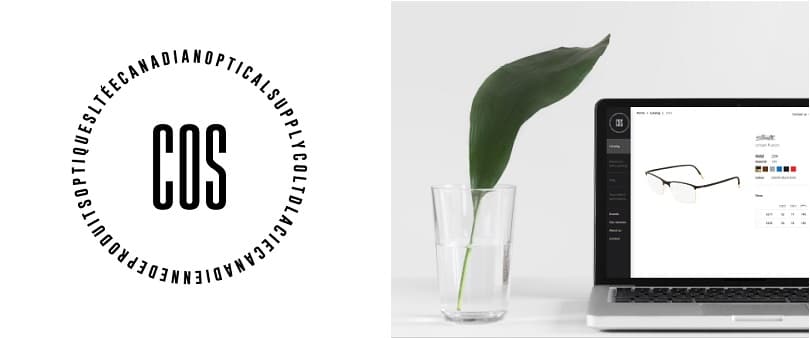
In order to showcase the products and services of the business, the first version of the site highlights the company catalog and features a highly efficient search engine. Along with allowing for a quick search via product code, the website also provides multiple filters that are used to consult brand collections by targeted interest (material, colour, gender). Each product sheet features details regarding availability, dimensions as well as important information for placing an order. An added detail – eye care professionals can choose to hide prices if they are in the presence of a patient.
Featuring a sleek responsive design and intuitive navigation, the site underlines the quality of the offer and allows eye care professionals to easily consult product sheets from any platform (computer, smart phone and tablet). The collections will be regularly updated thanks to a content management tool made available to the company.
An e-commerce module will soon be added enabling eye care professionals to purchase their products through the internet site. This progressive development approach is part of the firm’s desire to propose new functions to its clients in a short period of time. Already established, the development plan will evolve according to eye care professional practices, especially the massive use of smart phones.
In the meantime, the first phase of the site is already a success. When tested with a sampling of both user types, the site received a wealth of positive comments.
Click HERE to read the press release.


